Contents
- 1 Introduction: The Butterfly Effect in Digital Marketing
- 2 Meet the Client: A Great Property with Terrible Metrics
- 3 The Illusion of the “Perfect” Video Ad
- 4 The Rising Panic and The Breaking Point
- 5 The Lower Third Trap: How Meta’s UI Killed the Conversions
- 6 The “Aha!” Moment on Mobile
- 7 The Psychology of the Scroll
- 8 The Algorithmic Punishment
- 9 Fixing the Invisible Error: The “Safe Zone” Framework
- 10 Restructuring the Visual Hierarchy
- 11 Relaunching the Campaign
- 12 The Turnaround: From Zero Conversions to a Flood of Leads
- 13 The Algorithm Learns
- 14 The Final Results: A 70% Drop in Acquisition Costs
- 15 Core Takeaways for Digital Marketers out there
- 16 Conclusion
- 17 The Macro Lesson from a Micro Mistake
- 18 The Pre-Launch Checklist to Prevent a Formatting Disaster
- 19 Stop Blaming the Algorithm
- 20 Ready to Scale Your Campaigns Without the Guesswork?
Introduction: The Butterfly Effect in Digital Marketing
In the world of paid advertising, we often talk about “the big picture.” We obsess over audience targeting, campaign structures, massive budget allocations, and high-level funnel strategies. But any seasoned media buyer will tell you a secret: sometimes, it’s not the macro strategy that breaks a campaign. It’s the micro details.
A single misplaced comma in your ad copy, a broken tracking pixel, or as we are about to explore a tiny visual overlap in your video ad can create a devastating butterfly effect. What seems like a negligible detail on the back end can completely destroy the user experience on the front end. And when the user experience breaks, the algorithm punishes you, leaving you staring at a dangerously high Cost Per Lead.
This is the story of a recent client who had everything going for them: a phenomenal real estate property, a generous ad budget, and a video ad with a killer hook. Yet, their campaign was bleeding money. By the time they came to me, they were convinced that Meta advertising simply “didn’t work” for their niche anymore. But the reality wasn’t an algorithm issue; it was a formatting blind spot.
Meet the Client: A Great Property with Terrible Metrics
A few weeks ago, a highly stressed client brought me in to audit their Meta Ads account. They were running a lead generation campaign for a beautiful new property development. In theory, this campaign should have been a home run. The property was in a highly desirable location, the pricing was competitive, and the demand in the market was palpable.
However, the dashboard told a completely different, horrifying story.
The campaign was actively spending their daily budget, but the results were abysmal. Conversions had slowed to an agonizing crawl. The few leads that did trickle in were so expensive that the entire campaign was mathematically unviable. The client was panicking, pacing the floor, and repeatedly pointing to the one metric that was keeping them awake at night: an astronomically high Cost Per Lead.
“The hook is exactly what the gurus say to do. The property looks stunning. Why is nobody clicking the call-to-action?”
They weren’t wrong. When I first looked at the video asset on my desktop, it looked pristine. It was a high-definition, fast-paced vertical video designed perfectly for Reels and Stories. The first three seconds featured a visually stunning sweep of the property a perfect hook to stop the scroll.
But still, the campaign was suffering from a high Cost Per Lead that was skyrocketing day by day. Something wasn’t adding up.
The Illusion of the “Perfect” Video Ad
When you are diagnosing a high Cost Per Lead, you have to start crossing off the usual suspects one by one:
- Audience Targeting: Were they showing high-end property ads to an audience with no purchasing power? No, the targeting was dialed in perfectly.
- Bidding Strategy: Were they using the wrong objective? No, they were properly optimized for leads.
- Ad Fatigue: Had the audience seen the ad too many times? No, the frequency was well under 2.0.
- The Landing Page: Was the drop-off happening after the click? No, the Click-Through Rate (CTR) was in the basement. People weren’t even making it to the landing page.
The data clearly pointed to the creative. The video was failing to do its job. But why?
As marketers, we often fall victim to the “Creator’s Curse.” We review our video assets in a sterile, perfect environment. We watch them on large desktop monitors, inside Premiere Pro, or perfectly centered on a Slack message. In those environments, the client’s video was a 10 out of 10. The text on the screen which listed the incredible Unique Selling Propositions (USPs) of the property was beautifully animated.
The problem is, your customer does not live in a sterile desktop environment. They live on a chaotic 6-inch mobile screen. And if you don’t design for that exact environment, you will inevitably face a high Cost Per Lead.
The Rising Panic and The Breaking Point
The longer a broken campaign runs, the more the algorithm gets confused. Because nobody was clicking the Call-To-Action (CTA), Meta’s system assumed the ad was low quality. To compensate, Meta started charging a premium just to show the ad to people, pushing the CPMs (Cost Per Mille) higher.
It was a vicious cycle. Lower engagement led to higher costs, which led to an even more severe, completely unsustainable high Cost Per Lead.
The client was ready to pull the plug, scrap the entire video shoot, and start from scratch a decision that would have cost them thousands of dollars in lost production value. But before they paused the ads, I decided to do one final check. I didn’t look at the Ads Manager on my desktop. I picked up my phone, opened the Meta app, and forced the ad to preview directly in my Instagram Reels feed.
And right there, in a matter of seconds, the invisible error suddenly became blindingly obvious.
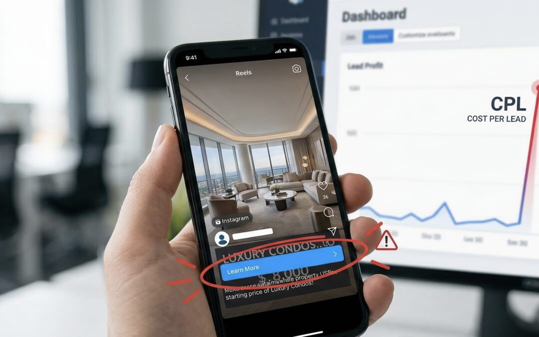
The Lower Third Trap: How Meta’s UI Killed the Conversions
The “Aha!” Moment on Mobile
You see, a high Cost Per Lead rarely happens in a vacuum. The algorithm doesn’t just arbitrarily decide to charge you an exorbitant amount of money for no reason. It is almost always a symptom of a disconnect between the ad creative, the platform’s delivery system, and the user’s experience.
When I pulled up the client’s ad on my smartphone, the mystery of the failing campaign unraveled in about three seconds.
The video itself was gorgeous. The first frame showed a sweeping drone shot of the property. But the crucial text the words that actually sold the property was entirely hidden.
The video editor had placed all of the vital information in the “lower third” of the video. In traditional television and desktop video editing, the lower third is the gold standard for text placement. It looks cinematic, clean, and professional. But on Instagram Reels, Facebook Feed, and Stories, the lower third is absolute chaos.
Meta overlays its own unchangeable User Interface (UI) elements directly over the bottom 20% to 30% of a vertical video. This includes:
- The profile picture and account name.
- The primary text (the caption).
- The scrolling audio track information.
- The giant “Send Message” or “Learn More” Call-To-Action (CTA) button.
Because the editor had placed the property’s Unique Selling Propositions (USPs) the starting price, the location, and the luxury amenities right at the bottom, Meta’s UI completely swallowed the text. This visual collision was the direct cause of their notoriously high Cost Per Lead.
The Psychology of the Scroll
To understand why this simple overlap is so destructive, we have to look at the psychology of the end-user.
People do not log into Instagram or Facebook to look at ads. They are there to be entertained, to catch up with friends, or to mindlessly scroll. Your ad is an interruption. When a user stops scrolling to watch your video, you have a fraction of a second to answer three subconscious questions for them:
- What am I looking at?
- Why should I care?
- What do you want me to do next?
Because the client’s USPs were completely masked by Meta’s CTA and headline, the user could only answer the first question. They knew they were looking at a nice house. But they had absolutely no context.
Was this property for sale? Was it an Airbnb? Was it just an architectural showcase page posting pretty houses? Without the text visible to tell them why they should care, the user had zero incentive to click the CTA. They just watched a pretty video and kept scrolling, leading to an incredibly high Cost Per Lead.
If your audience cannot see the offer, they will not click. And if they do not click, they are going to scroll past, triggering a high Cost Per Lead because you are paying for impressions that yield zero intent.
The Algorithmic Punishment
This lack of context didn’t just hurt the client’s pride; it actively worked against them in Meta’s advertising auction.
Meta’s algorithm is essentially a matchmaking machine. It wants to pair interesting content with users who are likely to engage with it. When the algorithm serves an ad to a thousand people and nobody clicks the CTA, the system interprets the ad as “low relevance” or “poor quality.”
Here is what happens behind the scenes when an ad gets poor engagement:
- Relevance Scores Drop: Meta ranks your ad lower compared to your competitors.
- CPMs Increase: The platform charges you more money just to secure placement in the feed.
- Conversions Tank: The algorithm stops trying to find high-intent buyers and just dumps your ad wherever it can.
The client assumed the platform was broken, but the root cause of a high Cost Per Lead in this scenario was purely mechanical. The video had a great hook, but the context of the hook was invisible.
We often forget that an ad is not just a piece of art; it is a functional tool. If the buttons, text, and visuals don’t work together harmoniously on the final screen, the tool breaks. I explained to the client that to reverse a high Cost Per Lead, you must design specifically for the platform’s constraints, not just for aesthetics.
The fix wasn’t going to require a new video shoot or a massive shift in strategy. It required a simple, strategic shift in formatting.
Fixing the Invisible Error: The “Safe Zone” Framework
Stopping the Bleed
The very first step to fixing a dangerously high Cost Per Lead is to stop throwing good money after bad. We immediately paused the underperforming ad sets. The client was hesitant pausing campaigns can sometimes reset algorithmic learning but when you are dealing with a fundamental UI clash, letting it run only trains your pixel to find the wrong people (or nobody at all). We needed a clean slate to cure their high Cost Per Lead.
There is a massive difference between an ad that fails because the offer is weak, and an ad that fails because the offer is invisible. Once we knew the issue was formatting, the solution became mechanical rather than strategic.
Establishing the “Safe Zones”
I got on a call with their video editor and introduced them to the concept of platform “Safe Zones.” Every major vertical video platform Meta Reels, TikTok, YouTube Shorts has specific dimensions where text is guaranteed to be visible without user interface (UI) interference.
If you don’t map your video edits to these invisible boundaries, you are gambling with your ad spend. Here is the breakdown we used to rescue the campaign:
- The Top 15% (Danger Zone): Avoid putting crucial text here. It is often covered by the app’s header, search bars, or the “Reels” logo.
- The Bottom 30% (The Black Hole): This is the absolute danger zone on Meta. This is where the profile name, captions, scrolling audio, and the crucial CTA button live. Placing your core message here is a guaranteed recipe for a high Cost Per Lead.
- The Right Margin (Engagement Zone): Often cluttered with like, comment, share, and save buttons. Keep text away from this edge.
- The Center Canvas (The Sweet Spot): The middle 50% to 60% of the screen is your safe haven. This is where your hooks, Unique Selling Propositions (USPs), and vital text must live.
Restructuring the Visual Hierarchy
Armed with the Safe Zone templates, the editor went back to work. We didn’t change the actual video footage or reshoot anything. The gorgeous drone sweeps and interior shots of the property remained exactly the same.
Instead, we shifted the visual hierarchy. We took the critical text that had been buried in the lower third and moved it directly into the center-top area of the screen.
Now, within the first three seconds, a user scrolling on mobile would see the stunning property and immediately read:
“Pre-Sale Luxury Apartment| Starting at 6cr | Prime Anna nagar.”
Because the text was no longer fighting with Meta’s interface, users finally understood the context of the ad instantly. They saw the value proposition right in their natural eye-line, which meant they were actually incentivized to look down and click the CTA. It’s amazing how a simple Y-axis shift in Premiere Pro can be the ultimate antidote to a high Cost Per Lead.
Relaunching the Campaign
With the newly formatted videos in hand, we relaunched the campaign. To keep the test scientifically accurate, we kept the audience targeting, budget, and bidding strategies identical. We had to prove that the audience wasn’t the issue. The only variable that changed was the physical placement of the text on the screen.
The client was understandably nervous. They were terrified that after spending a few hundred dollars, we would just see a return to the same high Cost Per Lead as before.
But this time, the user experience was completely frictionless. The visual hook grabbed their attention, the centered text delivered the USP instantly, and the un-obscured CTA button gave them a clear next step. When everything works in harmony on the user’s mobile screen, the algorithm rewards you, rapidly driving down that previously stubborn high Cost Per Lead.
The Turnaround: From Zero Conversions to a Flood of Leads
The First 48 Hours Post-Relaunch
When we flipped the switch on the newly formatted campaign, the results weren’t instantaneously perfect Meta’s algorithm still needed a little time to navigate the learning phase with the new creative assets. However, within the first 48 hours, the early indicators were incredibly promising.
The most immediate change we saw was in the Outbound Click-Through Rate (CTR). Before the fix, users were just watching the pretty drone shots and scrolling past. Now, they were actually reading the newly centered text, understanding the real estate offer, and actively clicking through to the landing page. That terrifyingly high Cost Per Lead that had completely paralyzed the account just days prior finally stopped climbing and started to stabilize. We were officially back in the game.
The Algorithm Learns
The true magic happened as Meta’s algorithm started receiving positive feedback loops.
Before we adjusted the video formatting, the system only saw users ignoring the Call-To-Action (CTA). That lack of engagement triggered algorithmic penalties, drove up ad auction costs, and directly caused a high Cost Per Lead.
Now, the narrative had flipped. Users were stopping their scroll, digesting the Unique Selling Propositions (USPs) clearly visible in the center of the screen, and engaging with the ad. Meta’s AI recognized this sudden spike in user interest and re-classified the ad as highly relevant. Because of this, the platform began rewarding the campaign with lower CPMs (Cost Per 1,000 Impressions).
As any media buyer knows, driving down your CPM while simultaneously increasing your Click-Through Rate is the ultimate, undeniable formula for curing a high Cost Per Lead. The algorithm was no longer working against us; it was actively hunting for our ideal buyers.
The Final Results: A 70% Drop in Acquisition Costs
By the end of week one, the Ads Manager dashboard looked like it belonged to a completely different company. We went from scraping the bottom of the barrel for expensive, unqualified clicks to generating a steady, predictable flow of high-intent real estate inquiries.
The client called me, absolutely thrilled (and noticeably less stressed), noting that their historically high Cost Per Leadhad plummeted by over 70%.
But the victory wasn’t just in the volume of leads it was in the quality. Because the users could finally read the price, location, and amenities before they clicked the CTA, they were highly qualified by the time they reached the landing page. We had officially slain the high Cost Per Lead dragon, not with a massive budget increase, a new landing page, or a total creative overhaul, but with a simple, one-inch adjustment to our mobile video formatting.
Core Takeaways for Digital Marketers out there
If you are running video ads and struggling to get conversions, do not immediately assume your product or your audience is the problem. Before you tear down your entire funnel, check your formatting. Here are the non-negotiable rules to follow:
- Always Preview on the Native App: Never approve a video ad based solely on how it looks on your desktop monitor or a Slack attachment. Send it to your phone and open it in the actual Instagram, Facebook, or TikTok app to see exactly what the user will see.
- Respect the Safe Zones: Keep all crucial text, USPs, and hooks out of the bottom 30% and top 15% of your vertical videos. Meta’s UI will ruthlessly cover your hard work if you place it there.
- Align Your Visual Hierarchy: To prevent a high Cost Per Lead, ensure your video’s visual hierarchy guides the user’s eye directly to your core offer, completely free from unchangeable app interface interference.
Conclusion
The Macro Lesson from a Micro Mistake
We have spent this entire case study dissecting a single, seemingly insignificant formatting choice: placing text in the lower third of a vertical video. But the reality is, this one-inch overlap is one of the absolute most common reasons advertisers experience a sudden, inexplicable high Cost Per Lead.
When you zoom out, the lesson here isn’t just about video editing software, aspect ratios, or avoiding the bottom of the screen. It is fundamentally about user empathy and frictionless design. Your prospects are endlessly bombarded with content. If you make it even slightly difficult for them to understand what you are selling, they will punish you with their apathy. They will scroll past without a second thought, and the advertising algorithm will subsequently punish you with a high Cost Per Lead.
As media buyers and business owners, we have to stop reviewing our marketing assets in a vacuum. A video is only as good as the environment it is viewed in. By designing specifically for the chaotic, cluttered real estate of a mobile social media feed, you give your offer the breathing room it needs to actually convert.
The Pre-Launch Checklist to Prevent a Formatting Disaster
Before you upload your next batch of creatives and risk triggering a high Cost Per Lead, you need a system. Implement this pre-flight checklist for every single video ad your team produces:
- The Safe Zone Verification: Is all critical text (hooks, USPs, prices) kept strictly within the center 50% to 60% of the screen?
- The Native Mobile Preview: Have you sent the video to your actual smartphone and opened it inside the Instagram or Facebook app to mimic the end-user experience?
- The “3-Second Silence” Test: If someone watches the first three seconds of your video on mute, is the core offer immediately obvious purely through the visible on-screen text?
- The UI Overlap Check: Are you absolutely certain that the account name, the caption text, the scrolling audio track, and the crucial CTA button are not blocking anything important?
Skipping even one of these vital steps is a guaranteed one-way ticket to a high Cost Per Lead. Don’t let a brilliant marketing strategy fail because of a lazy export from Premiere Pro.
Stop Blaming the Algorithm
It is incredibly easy to point fingers at Meta or TikTok when campaigns go sideways. We love to blame iOS tracking updates, mysterious algorithm changes, or “bad traffic quality.” But more often than not, the true culprit behind a frustratingly high Cost Per Lead is staring right back at us in the creative dashboard.
The algorithm is not a malicious entity; it is simply a mirror reflecting user behavior. If your users cannot see the offer because it is buried under a “Send Message” button, they will not click. By taking absolute control of the micro-details like ensuring your value proposition is front and center you take control of your results.
The real estate client in this story didn’t need a new property to sell. They didn’t need a bigger budget, and they certainly didn’t need to abandon Meta ads altogether. They just needed to shift their text up by a few inches. Once they did, the conversions poured in.
Ready to Scale Your Campaigns Without the Guesswork?
If your business is currently bleeding daily ad budget and you cannot seem to figure out why you are stuck with an unsustainably high Cost Per Lead, you do not necessarily need to start from scratch. Sometimes, you don’t need a total teardown; you just need an expert set of eyes to spot the invisible errors that are quietly killing your conversions.
Don’t let minor formatting mistakes drain your marketing budget. Audit your creative, respect the mobile platform’s native interface, and watch your cost per acquisition drop.
Book a free consultation with Rubin George who is a certified meta ads expert